
Meals on Wheels volunteer delivery app
Mobile app concept to streamline volunteer work
Volunteers at Meals on Wheels (MOW) provide meals and wellness checks to seniors and disabled veterans in their communities.
We learned about the current “bumps in the road” volunteers encounter and created a mobile solution to provide a smoother delivery experience.
Duration
2 weeks
Team
3 designers
My Role:
Lead UX research
Lead UX/UI design on meal checklist feature
UX strategy
Deliverables
Business and user research
Usability testing
Wireframes
Clickable hi fi prototype
Brief app overview
Three features to improve connection and efficiency on volunteer routes:
Meal checklist for error prevention when picking up meals
Optimized navigation to make the route planning process easy and flexible
Client information cards and forms to convey important details to volunteers along their route and open lines of communication
Background
Meals on Wheels is a national organization that feeds about 2.4 million seniors a year. Their work is made possible by volunteers.
Volunteers provide three main services:

Graphic from Meals on Wheel’s website
Business insights
We see an opportunity to increase efficiency via an app.
MOW is a national company with many sites. The majority of volunteers use printed out paper for their routes. Addresses must be manually input into GPS systems. This seemed like a great opportunity to bring in app technology to assist volunteers.
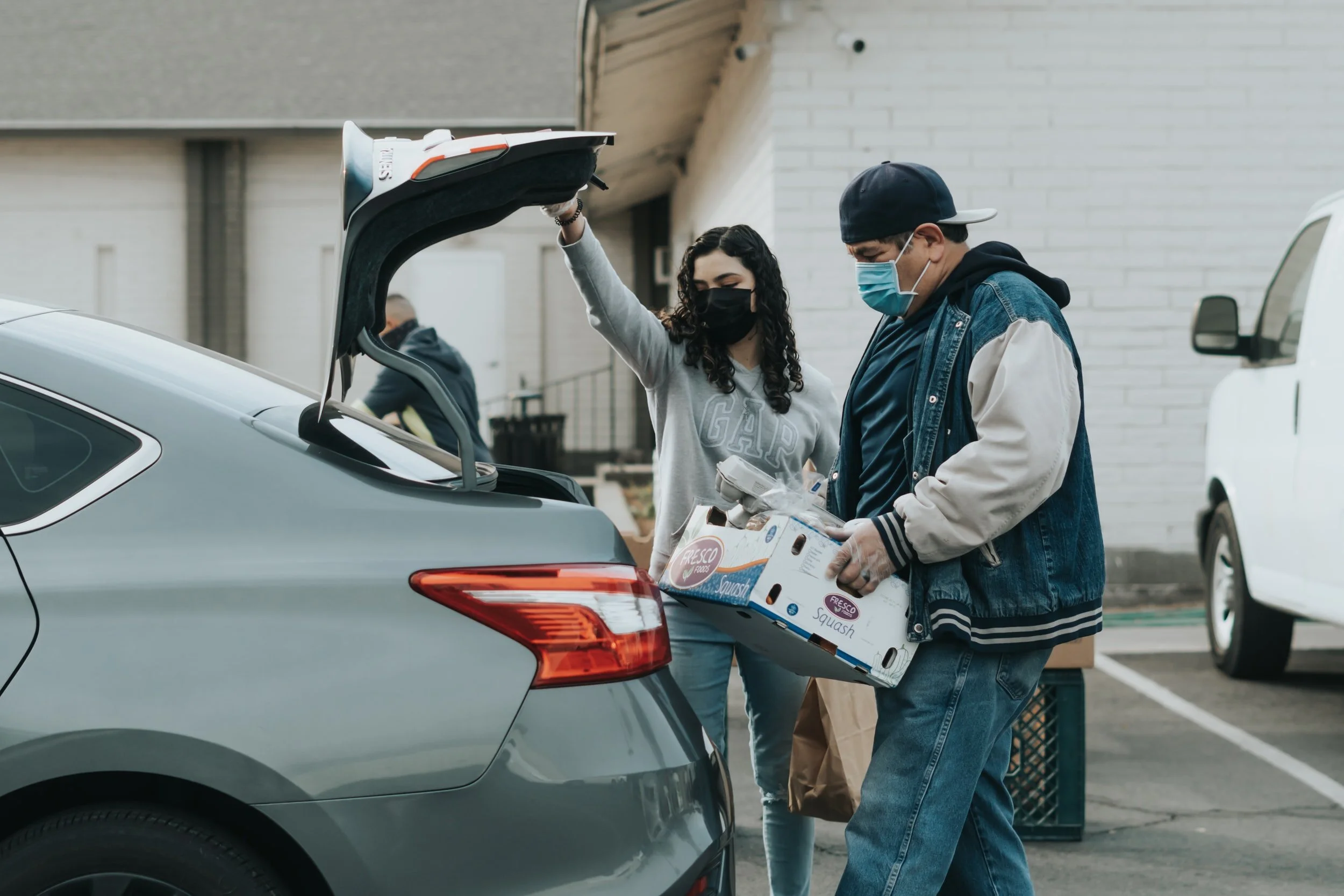
Photo from Unsplash

User research
Building empathy around the volunteer experience
Methods:
Volunteer interviews
Volunteer manager interview
Defining the target user
Seniors helping seniors - most volunteers are seniors themselves
Since they are retired and have time midday to deliver meals, seniors make up a significant percentage of MOW volunteers. We labeled this group “Empathetic Retirees” and placed their needs at the center of our designs.
The journey
Volunteer routes include four main steps

Journey map
Understanding user emotions and actions at each step
I organized volunteer interview insights at each step to understand the daily Empathetic Retiree volunteer journey.
Re-grouping and defining scope
Pain points emerge at three stages of the journey
I first visualized pain points over time, and found that some pain points were experienced later in the journey, but needed to be addressed earlier on, like miscounting meals.
Re-grouping and defining scope
Pain points revolve around needing more information, human error, and system inefficiency
I then grouped pain points by source to understand their roots. I found three roots: lacking information, human error, and system inefficiency.
Ideation
How might we limit human error, open lines of communication, and increase efficiency at each stage?
Our solutions:
Meal Checklist
Client Info Cards
Optimized navigation
Limiting human error
1) Meal Checklist

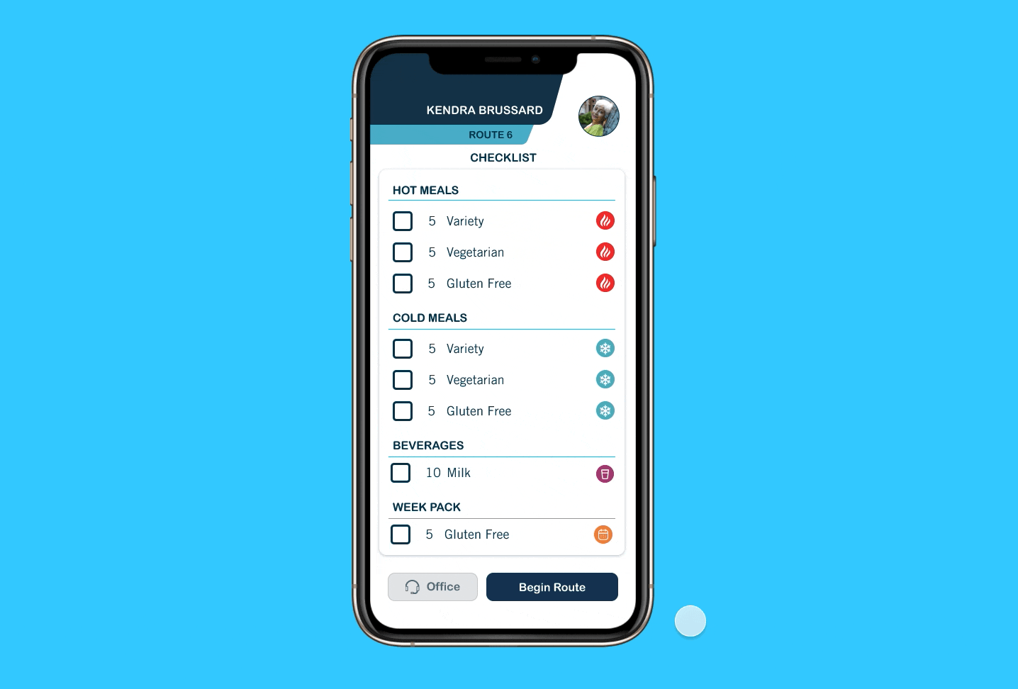
Benefits of checklist
Familiar way to track tasks
Grouping by category simplifies the pick up process
Organizing by meals, as opposed to person assigned, allows user to focus on task on hand without information overload
Some iterations of my design
Opening lines of communication
2) Client info cards


The info card provides all the info the volunteer needs in one place:
Photo of location, and notes to provide additional information when apartment is hard to locate (if there’s a dog, gate lock, ect)
Phone icon to easily call client or office during route
List of drop off items for quick reference upon arrival
Connection is important to volunteers.
Privacy is important to MOW.
While MOW can’t share additional personal information with volunteers, a good compromise was to provide additional ways to communicate with the client and company to enhance connection.
Addressing inefficiency
3) Optimized navigation

I contributed to the UX strategy on this feature.

Benefits of our navigation:
Adaptability: Capability for volunteer to edit list and navigation optimizes even if route changes (if person is not home, or if volunteer needs to return to a home).
Accuracy: Marking deliveries as “done” helps keep track of completed deliveries, as volunteers can have up to 20 clients.
Flexibility: We allow the volunteer to use the app navigation for some clients, but not for all if volunteer remembers where they live.

*Adjusting these pain points was outside of our scope for this project, as they would require changes to MOW business operation.
Additional considerations and additions
Visibility, branding, and personalization
Visibility:
Our target user is in a group that statistically struggles with far sightedness at higher rates. We made sure to include large buttons and high contrast between text and background colors.
Brand and personalization:
We implemented colors and fonts from the MOW brand style guide to provide continuity in branding.
We included a volunteer profile picture to deepen the volunteers’ sense of connection and belonging when logging into the app.
High fidelity walk through
Reflections
My biggest takeaway: efficiency can fuel connection
Increasing efficiency in the delivery process reduces stress and frustration and allows volunteers more time to focus on the client. The restraint of HIPAA regulations actually helped us to think outside the box and realize that making the experience more efficient could provide volunteers with more opportunities to connect with staff and clients.
Additional considerations on checklist
Since our Empathetic Retirees are more likely to be far sighted, I am curious if utilizing voice or other forms of tech can be implemented to improve the experience for them.
Overall reflection
This project was very meaningful to me, as I deeply value the work that Meals on Wheels carries out each day.
If it was not for Covid-19, it would have been great to do ride alongs with Meals on Wheels volunteers. Fortunately, through finding volunteers to interview and watching ride-along videos online, I was able to get a feel for the journey and the pain points that arise at each stage of the journey.
Since the volunteers carry out the same tasks each day, I found it helpful to approach our solutions task by task, while keeping in mind the overarching themes of efficiency and connection.
We presented our design to a MOW office and received feedback that our designs align very well with volunteer needs and would make the journey more efficient.